Learning about the different cultural references conveyed by different styles of Arabic script, geographically and historically. In Arabic, all scripts are cursive, but swash strokes can be used to make joins when needed. Scripts can be in harmony with their Latin counterpart, but independent.
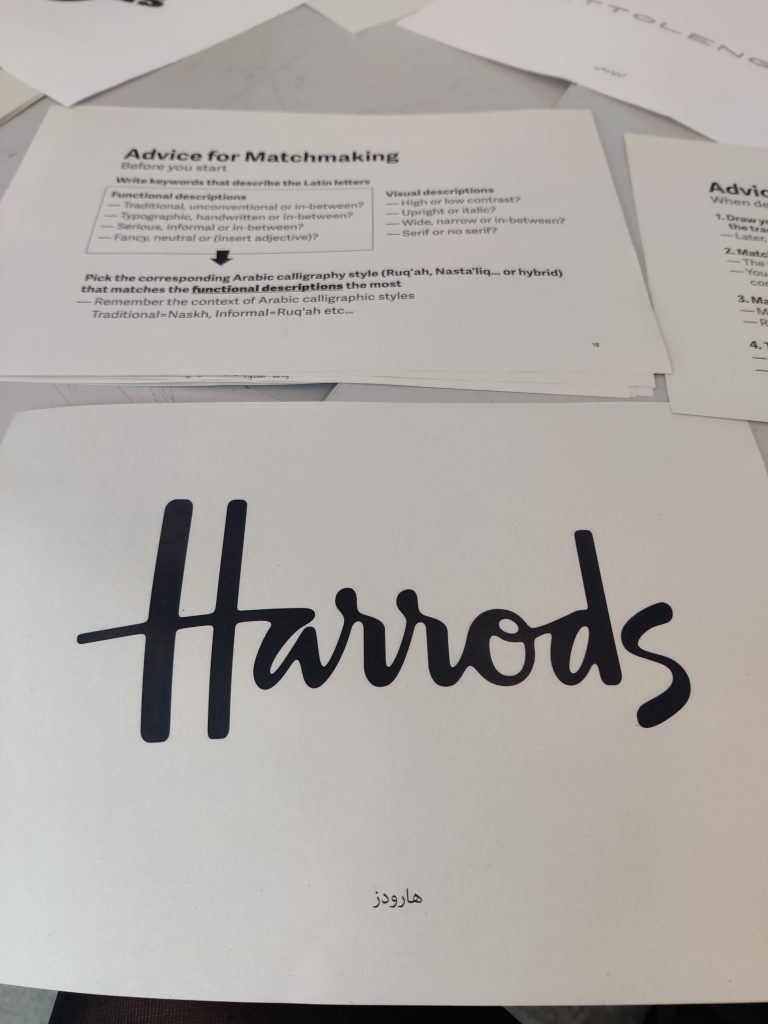
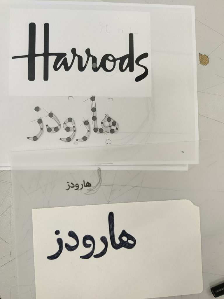
I chose the Harrods logo to translate. Thinking about its functional description: cursive, liquid, friendly but professional, handwritten (neatly not in a scrawl), a little old-fashioned. And its visual description: medium-high contrast, upright, narrow width, no serif.
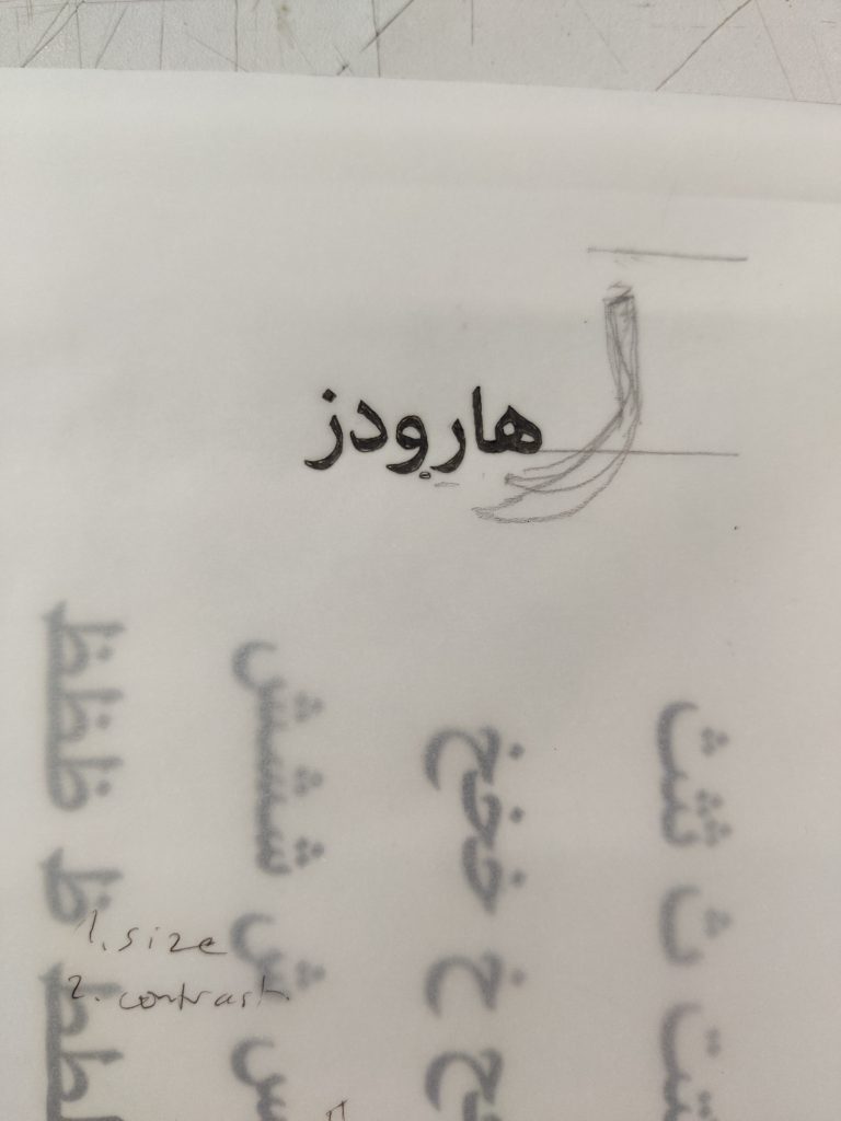
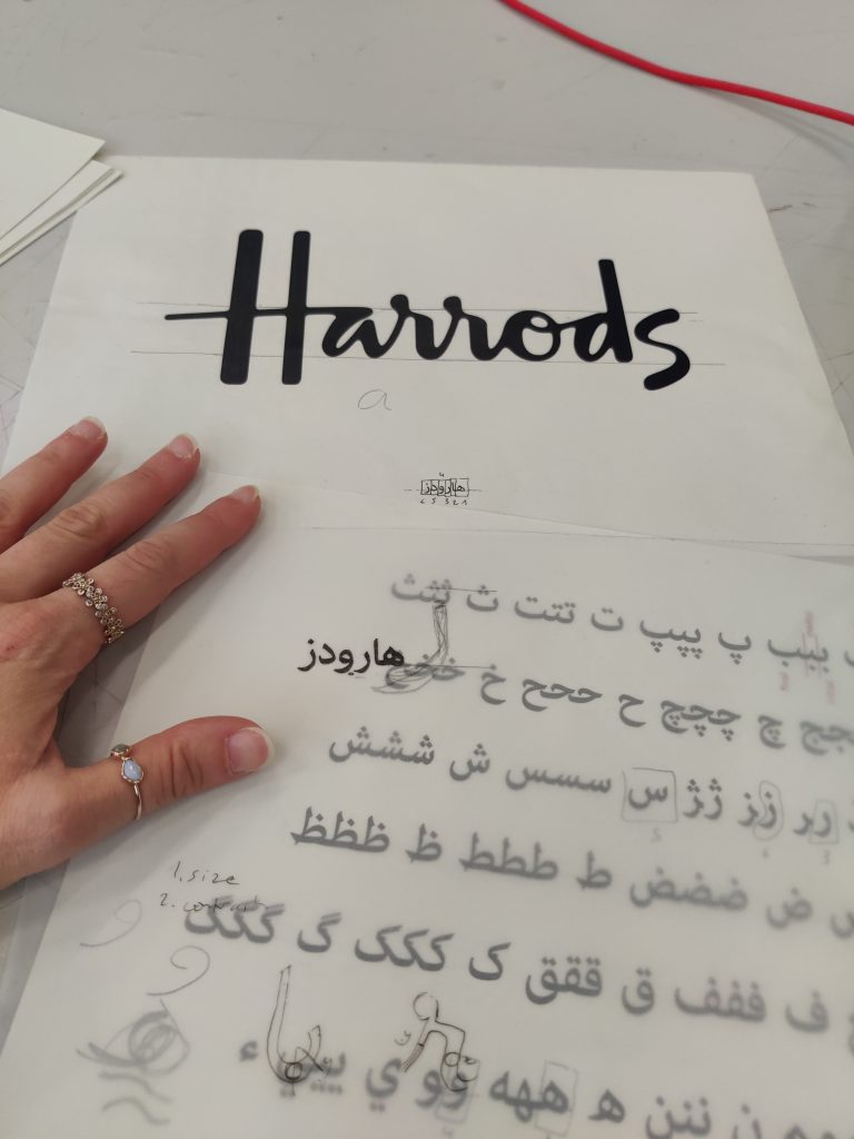
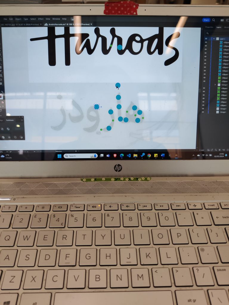
The contrast is the reverse of Latin: verticals are thin and horizontals are thick. I used Illustrator to create a guide for aligning the size and weight.
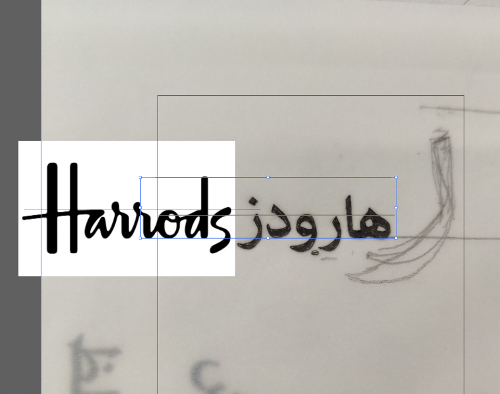
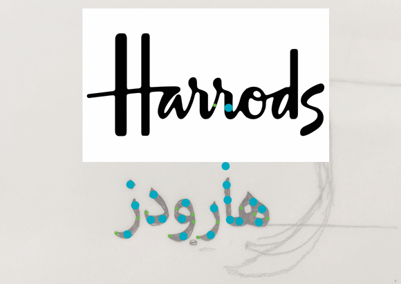
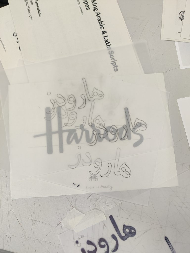
I iterated through traces of my translation, trying to add appropriate curvy liquidity and contrast.