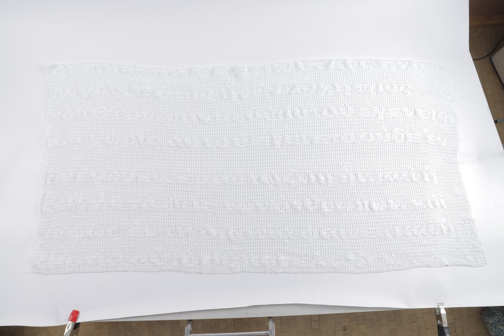
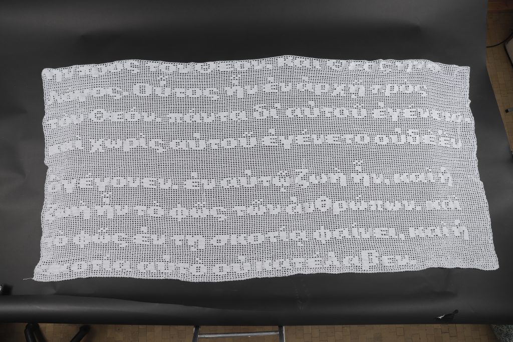
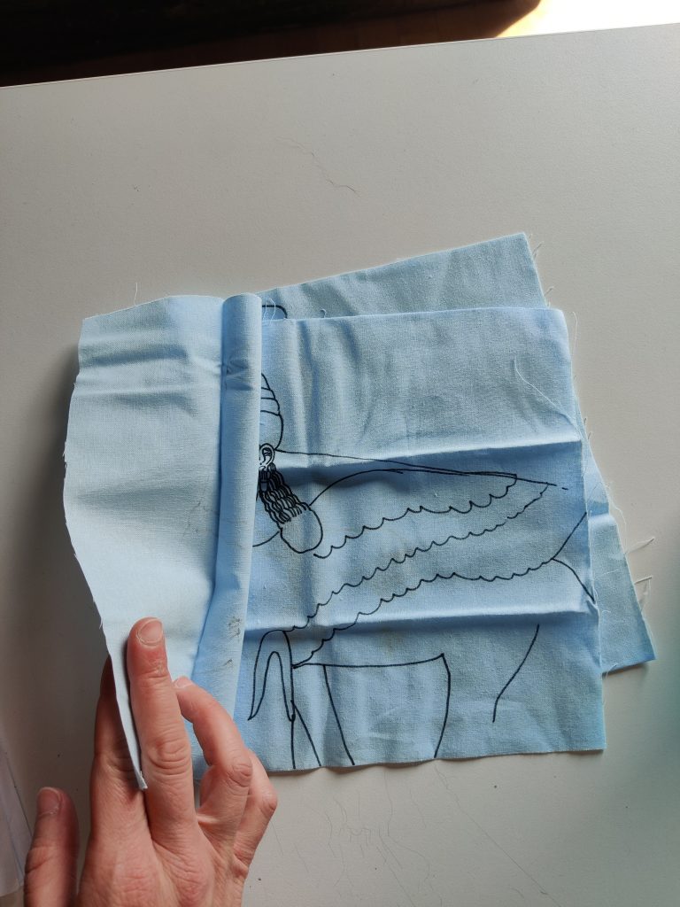
Considering what a change of metaphor from ‘a common thread’ to ‘cut from the same cloth’ implies for a design which depicts all the linked biblical artefacts I have been researching. Also thinking about how their scriptural counterparts were written down/linking projection 2 back to my manuscript exploration of projection 1, I consider drawing in ink on the same ‘page’/cloth so the artefacts are cut from the same fabric.
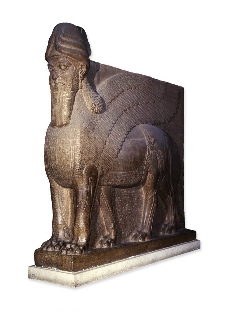
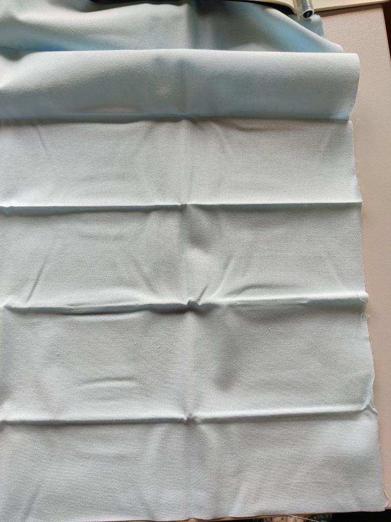
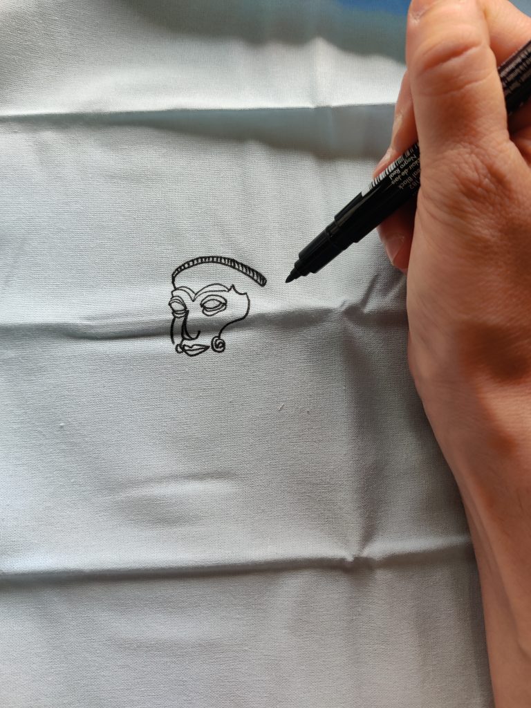
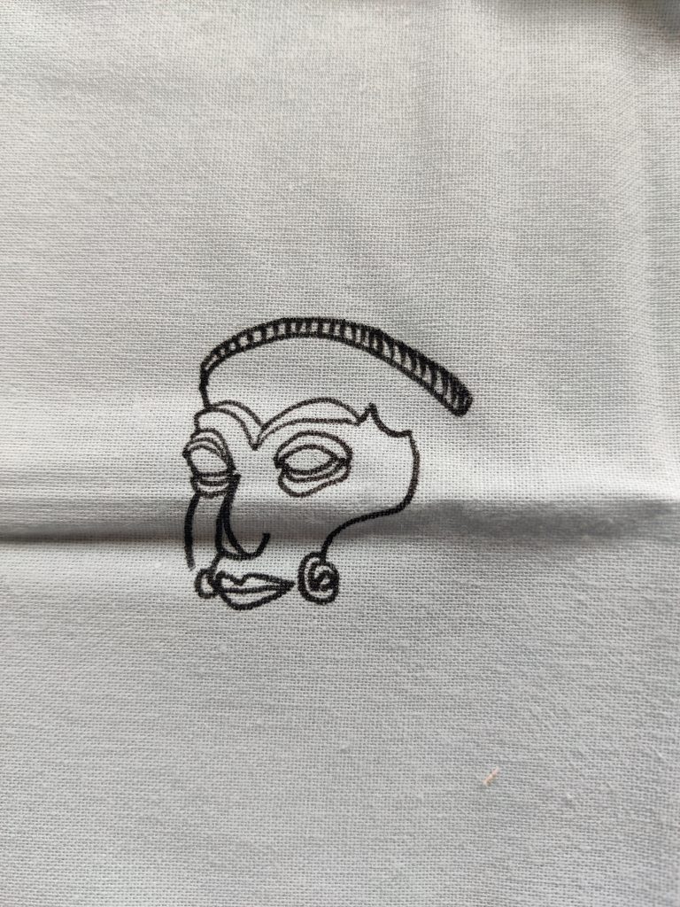
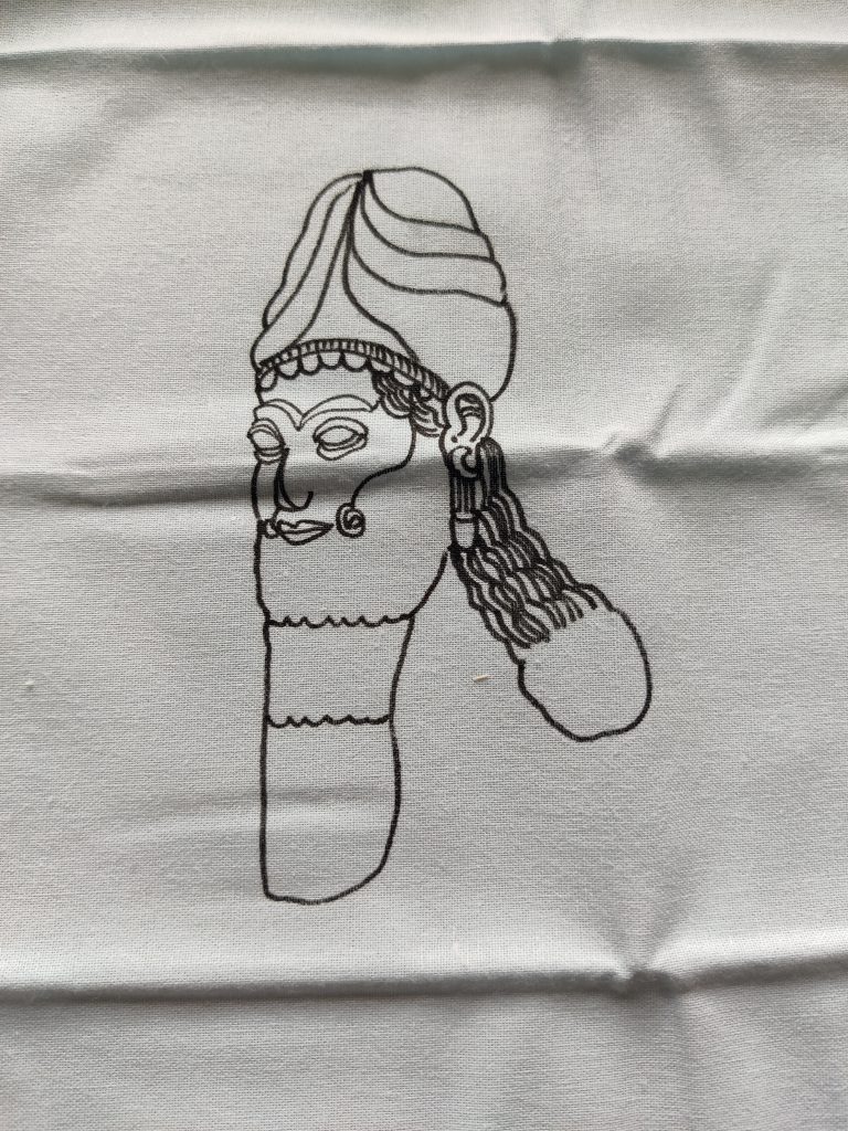
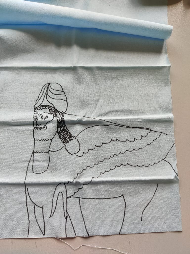
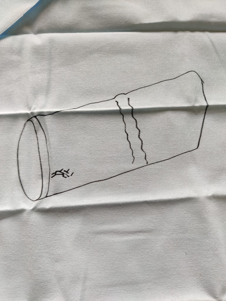
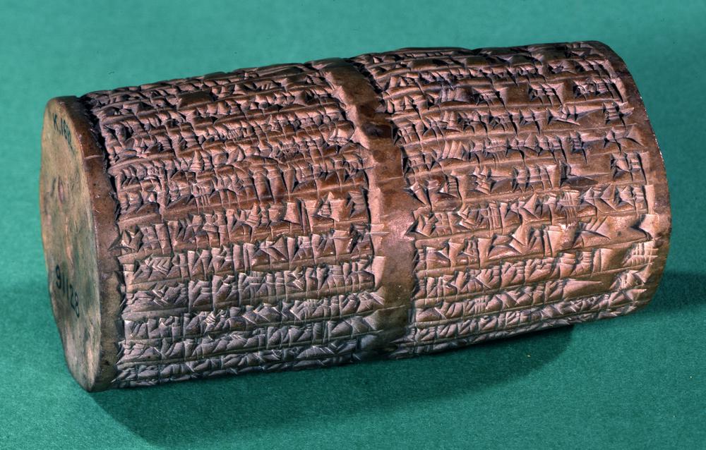
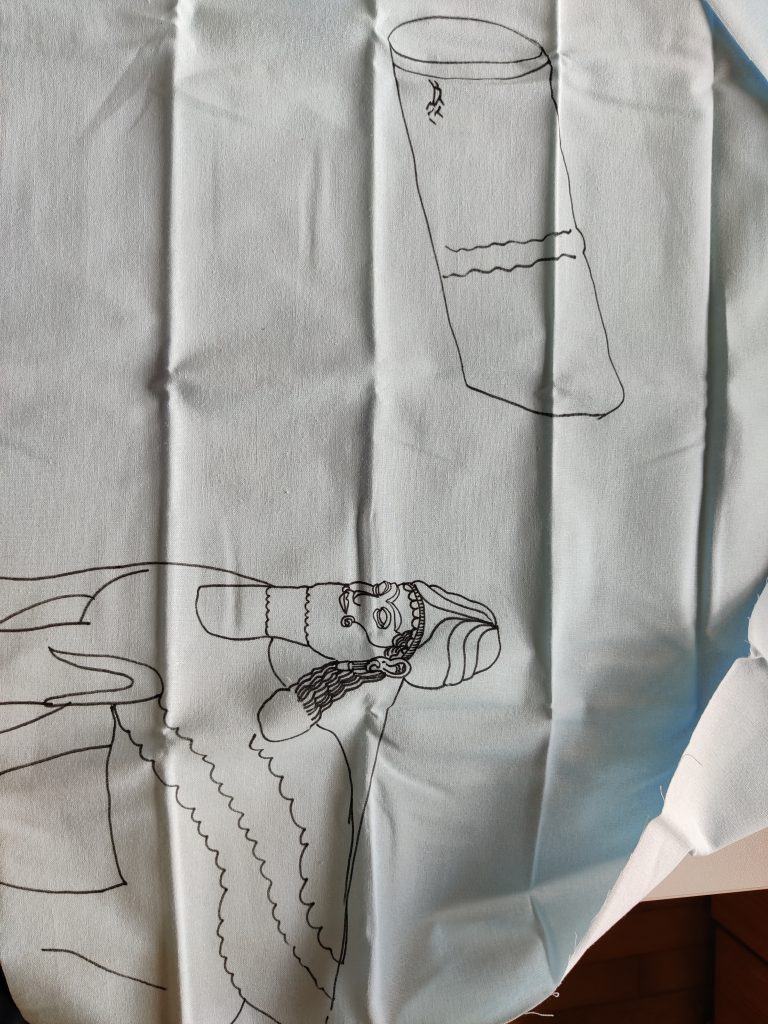
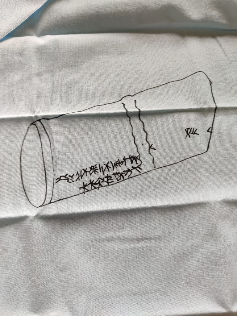
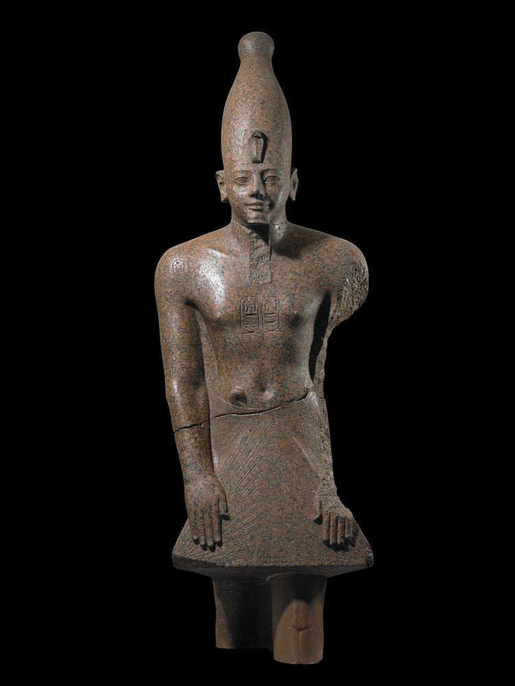
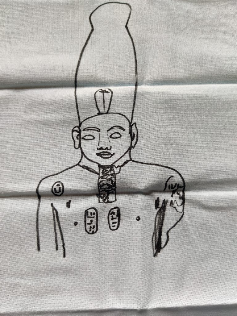
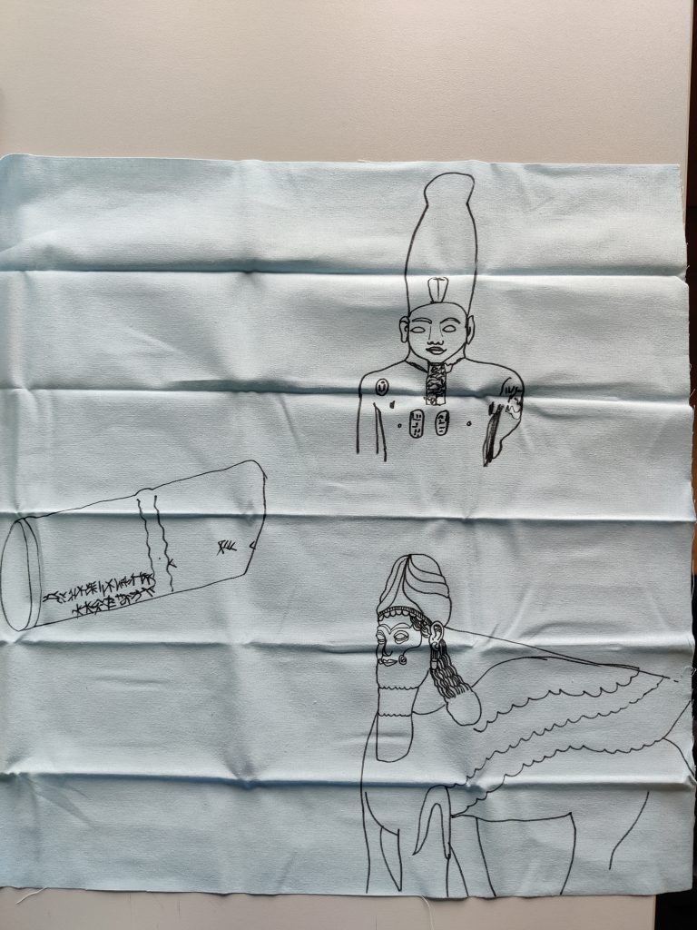
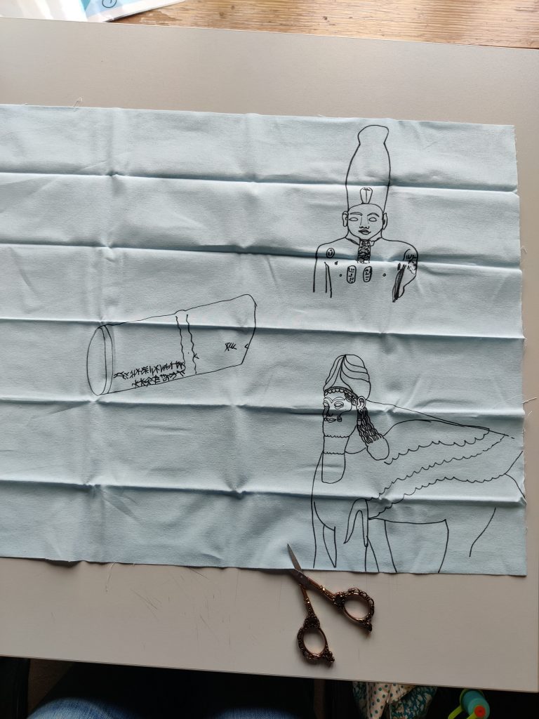
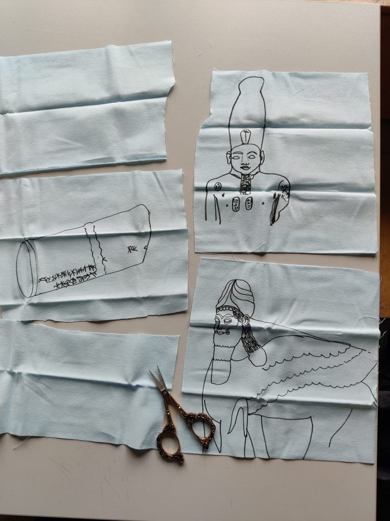
Thinking about this idea of one page becoming many pages. I am unsure about what to do about illustrating the cuneiform though, as unlike Koine Greek, I have less time to learn about it/how it is written. I do not want to misrepresent its meaning.
These were draw directly in pen as a kind of toile mock-up. Thinking about the cut pages and how they could be arranged together – stitched back as one tapestry or sewn together as a kind of book:
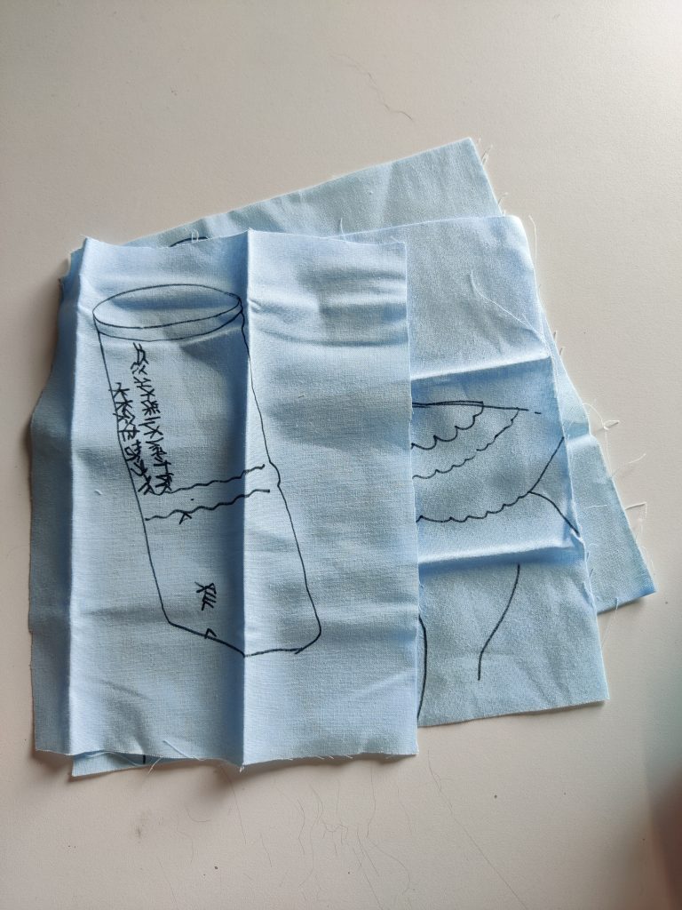
Thinking also about crocheting between them/crocheting captions to mirror the style of Projection 1.
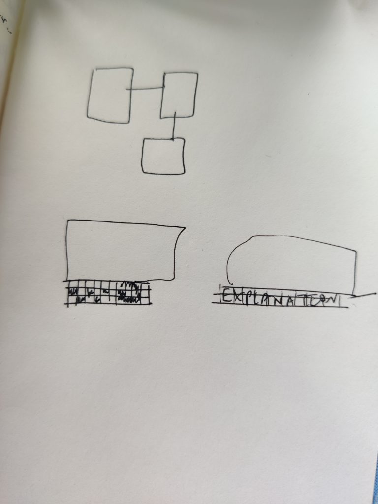
Wondering about how much intrigue should be/could be evoked and how much information to give away, e.g. location of artefacts (originally and presently), time period etc.
Returning to Projection 1, I consider how this message is being transmitted digitally in 3 senses: it is made with digits, it is made of 0s and 1s (open squares, filled squares), it is FALSE or TRUE.

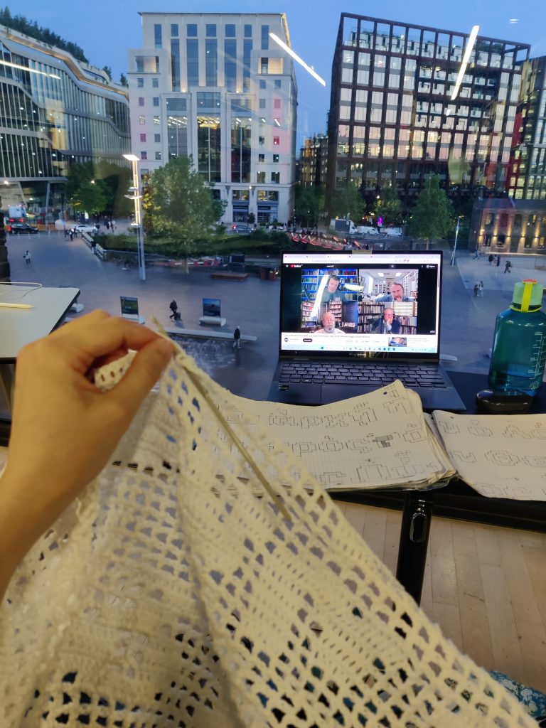
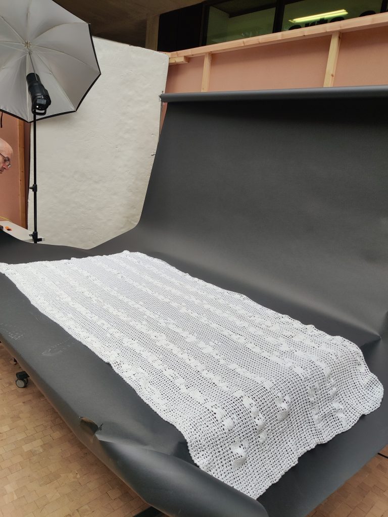
Exploring legibility and also realising I have made an error (!!!!!!) in the line spacing ! But the message remains the same – ruminating on what this means and what a manuscript’s line spacing/page details tell the reader about the author/scribe. This might be a happy mistake as I consider what is an ‘error’ and what is not; what makes a manuscript/translation erroneous/not trustworthy? Is it just the accuracy of the words, or do the visual features/other graphic communication design features affect its reliability? Reminiscent of a printing error, but the content is the same.
