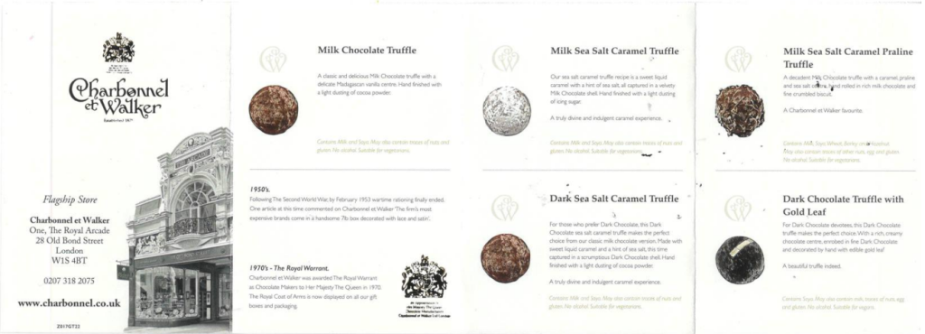
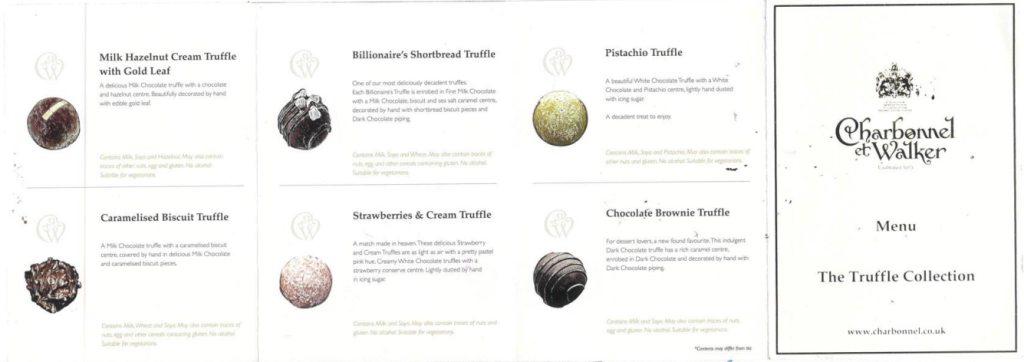
The translation of an A7 concertina-folded paper Charbonnel et Walker ‘The Truffle Collection’ menu. See scans below:


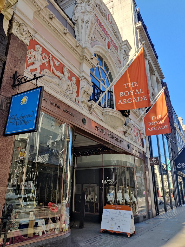
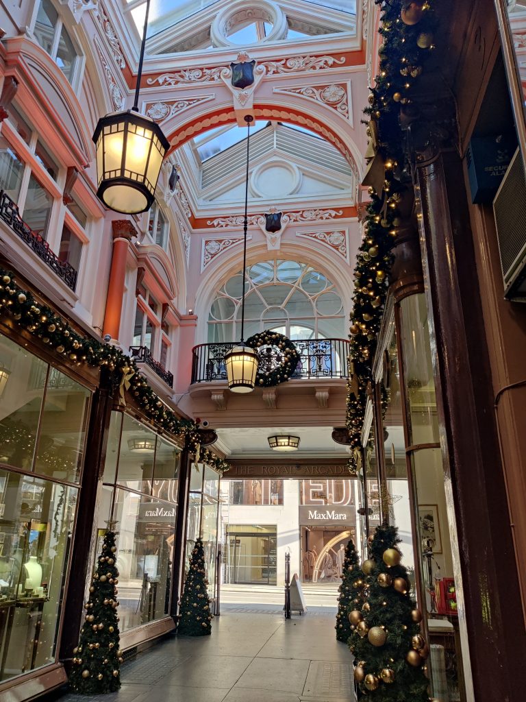
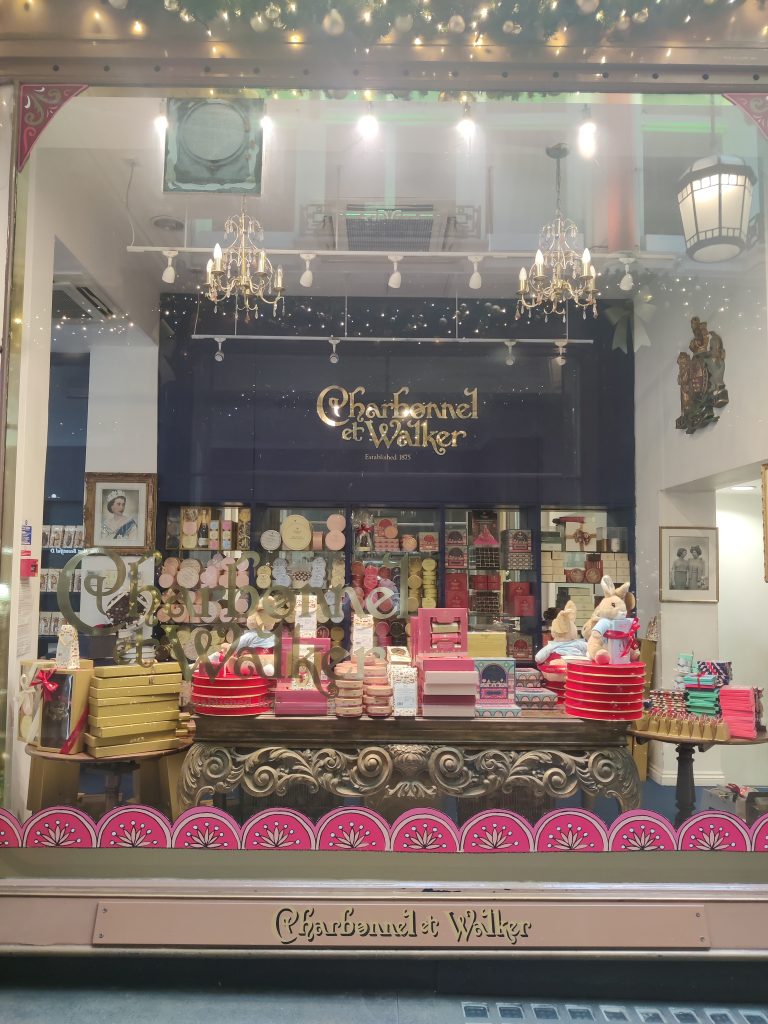
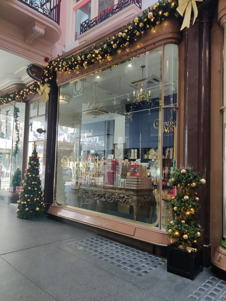
I investigated the target audience for these truffles: the flagship store is in The Royal Arcade, Bond Street, and a single truffle from the counter in a box is £3.50. They hold a Royal Warrant and the store is decked with pictures of HM The Queen Elizabeth II, who had a penchant for their rose and violet creams. The clientele tend to be well-off British people with clipped accents, and a myriad of tourists, mostly Middle-Eastern, Japanese, Chinese and American. These photographs were taken on a sunny Saturday morning before they opened:


I wondered what the antithesis of an ideal customer might be: perhaps someone with no disposable income. Or perhaps more extremely, a creature for whom chocolate consumption might be deadly, like a dog.
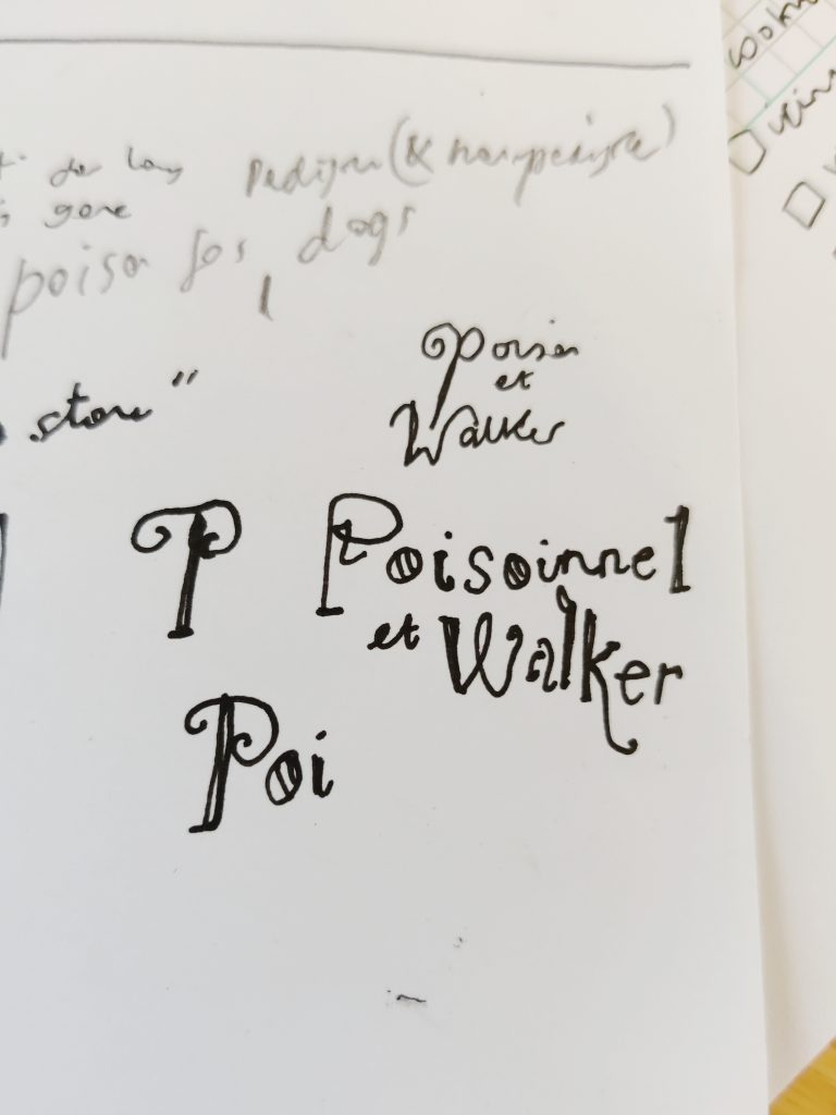
Translation 1: ‘Poisons for Dogs’

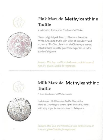
Translation 2: alternative text descriptions
Thinking about if the menu were translated into a digital format – what could the alt text read, if the images were not to load. Or if someone were to see the images in isolation, how might they describe them?


Translation 3: changing the branding
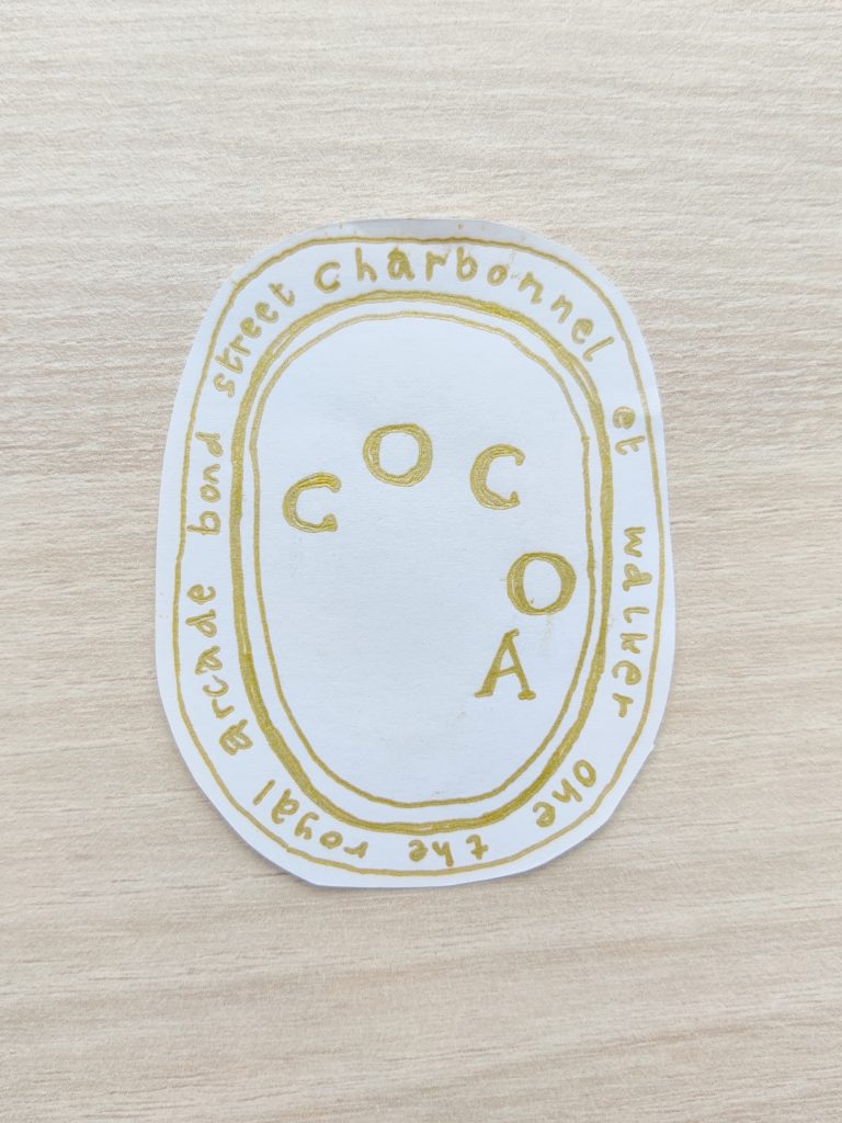
Initially loosely copying the logo with an ink brush and gold sharpie, to get an idea of its character but also to allow it to shapeshift and bend where it might not be meant to, before translating the style to mimic other luxury brands.


I considered the neighbours of the shop: they are all luxury fashion brands and none of them sell edible items. I wondered what it would be like if Charbonnel et Walker were to be translated into a fashion brand to fit in more seamlessly.
Also thinking about what it means to have “good taste”, not just in flavour but in aesthetics, fashion, stylistic choice – what determines this? Price tag? Quality? Arbitrary psychological associations?

I had played with the branding and mixed it with the styles of what could be their competitors. I considered the sans-serif trend of many of these designers, but when I pushed Charbonnel et Walker in this way, it felt like the brand’s character deteriorated.
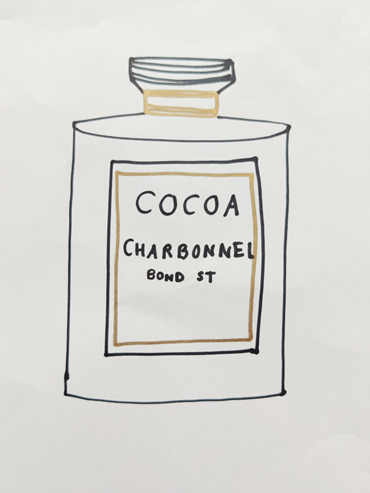
Exploring sensory translations: the scent of chocolate fragrance, the cosiness of chocolate in tactile form
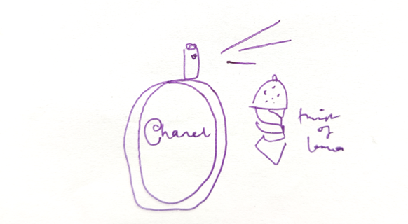
I considered the warmth and luxury of chocolate being translated into something wearable, like fragrance. The taste notes of the truffles translated into fragrance notes. As there is ‘Coco Chanel’, there arises ‘Cocoa Charbonnel’.


Opposite Charbonnel et Walker, the MaxMara window is full of beige and cream and white cosy knits and woollen jackets. I considered what it would be like for Charbonnel et Walker to bring out a fashion line: like chocolate, clothing can be warm, and made of luxurious ingredients (materials). It also says something about the wearer.
Looking at knit/crochetwear specifically and a woollen translation; a translation akin to Balenciaga’s translation of Bernie Sanders’ campaign logo into a fashion line (Fisher, 2017).
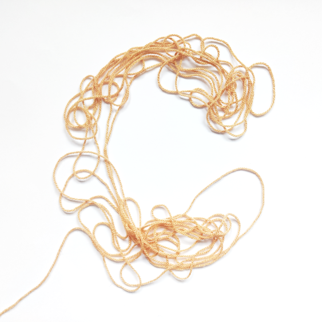
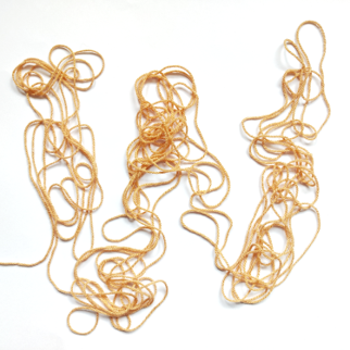

Like in Steyerl’s ‘In Defence of the Poor Image’ (Steyerl, 2012), there is some corruption that takes place in the pixel translation of the Charbonnel et Walker logo into crochet stitches. But there is also an effective manifestation of the chocolate characteristics of ‘cosiness’ and ‘warmth’ in a different form. Those sentiments are translated.
References
- Fisher, L. A. (2017) ‘Balenciaga’s Fall 2017 Menswear Show Was Inspired By Bernie Sanders’ Campaign Logo’, BAZAAR. Available at: https://www.harpersbazaar.com/fashion/fashion-week/news/a20026/balenciaga-bernie-sanders/
- Hito Steyerl, ‘In Defense of the Poor Image’, 2012